

Frank Frazetta
| FRANK FRAZETTA | [May. 11th, 2010|09:54 am] |
stroke damage in recent years, and his kids had been squabbling over their impending inheritance, but judging by a recent interview, he was feisty and lucid and enjoying life right up until the end, and for that I'm grateful. In honor of his passing, here's my analysis of seven notable aspects of Frazetta's work. 1.) Simple Tonal Values Few painters can resist the temptation to over-model forms, blending the edge of every shadow gradually from dark to light in an effort to make objects appear round and three-dimensional. But in reality, each object we see generally consists of one or two flat colors, without much gradual change from dark to light. The trick is in picking those one or two colors! Vermeer was the master of this; Frazetta was also incredibly good. If you were to convert a Frazetta painting into greyscale, and then trace that painting using only 4 values (white, light grey, dark grey, and black), you would see little difference between the greyscale original and your traced version. This is because Frazetta let his basic values accomplish most of the work: he chose the proper value for each surface, and therefore needed very little dark-to-light blending to indicate roundness. The results are strikingly simple and boldly three- dimensional: 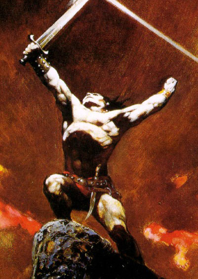 See how flat and simple that skin color is? Two shades of brown and one shade of white. You could cut those colors out of construction paper with dull scissors, and if you assembled the shapes as they appear above, it would still look great. Had a lesser artist painted this figure, it would be crammed with varied tones and highlights, looking oily and sun-burnt. 2.) Memory Painting Frazetta is known for having painted most of his pictures straight from his head, instead of the standard practice (among realists) of relying on models. This approach may seem to be a foolish handicap, or even proof of laziness. But I believe it enabled Frazetta to compose pictures of greater power than most of his contemporaries. To quote the excellent Carlson's Guide to Landscape Painting: "The memory exaggerates the essentials; the trifles of incidents tend to become blurred. Protracted painting of what one sees before him dulls the initial expressive shock. In painting from memory, the whole stress is laid on expressive agents. In direct-from-nature painting, much useless lumber insinuates itself, interesting for its own sake, but derogatory to the whole. The eye is greedy. There is always too much material seen, with not enough synthesis. Until mastery of memory is reached, the brain refuses to act as a filter." Due to his reliance on memory, Frazetta's paintings never look inexpressive, nor cluttered with "useless lumber." They look like windows into his dreams. 3.) Appealing Proportions Speaking of dreams, we arrive at the legendary "Frazetta Girl." I don't know what that is beneath a woman's skin which men find so appealing -- muscle, bones, fat, or some mysterious Other Element -- but whatever it is, Frazetta made sure it filled his women near-to-bursting. However, unlike most artists who draw zaftig women, Frazetta managed to make his look fit and petite. He did this through careful adjustment of their proportions. Their thighs, hips, and breasts are large and full, but their hands & feet, wrists & ankles, faces, necks, and midriffs are slim and small. And unlike actual hefty people, their ribs are often visible:  This clever combination of traits resulted in characters who are at once natural-looking and impossibly beautiful. (Permit me to add these comments I ran across by a female blogger: "It was the work of Frank Frazetta that made me realize that gaining healthy weight after anorexia was a beautiful and strong thing. ... His art made me understand that I didn't need to force myself to be unhealthy to be slender. ... I could be skinny or fat or everything in between and it would all be beautiful. Thank you, Frank Frazetta. ... When I feel disgusted with my body, I stare at [Frazetta's Cat Girl II] and repeat,'Beautiful, shapely, soft and strong' until I get it.") He also combined the facial characteristics of various ethnicities with the pale eyes and skin common to his likely audience, producing faces that look both exotic and approachable:  His men, too, are bursting with muscles without looking muscle-bound, due to another clever trick. They have the lean silhouette of a gymnast or boxer, implying agility, but packed improbably into that frame are the swollen, well-defined muscles more common to body-builders. 4.) Curved & Diagonal Vectors Vectors are invisible lines that chart the paths our eyes will likely take through a picture. Even if we choose not to follow those paths, we recognize them by the prominent trails of lines or shapes which constitute them. Vectors help determine a picture's mood: horizontal vectors indicate restful passivity, verticals indicate rigid formality, curves and diagonals indicate dynamism. Since most objects we observe in life are vertical or horizontal, artists tend to default to compositions that rely on vertical and horizontal vectors, often without realizing the harm this does to their pictures' dynamism. Frazetta commonly resisted this tendency, building bold curves and diagonals into his images. Compare the vectors in this Frazetta: 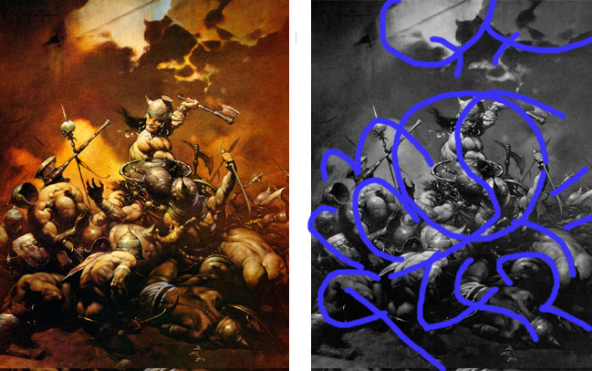 with the vectors in these action paintings by other great artists: 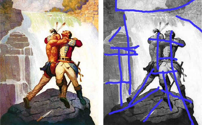 (N. C. Wyeth) 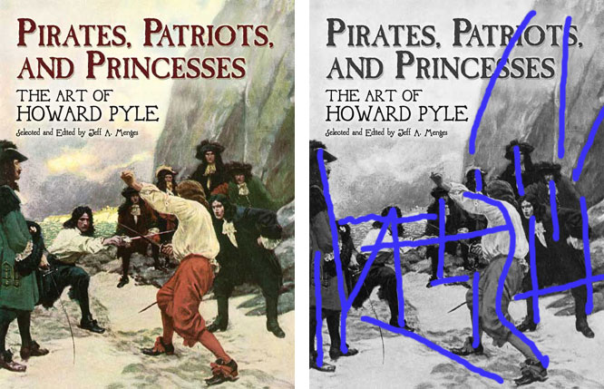 (Howard Pyle) 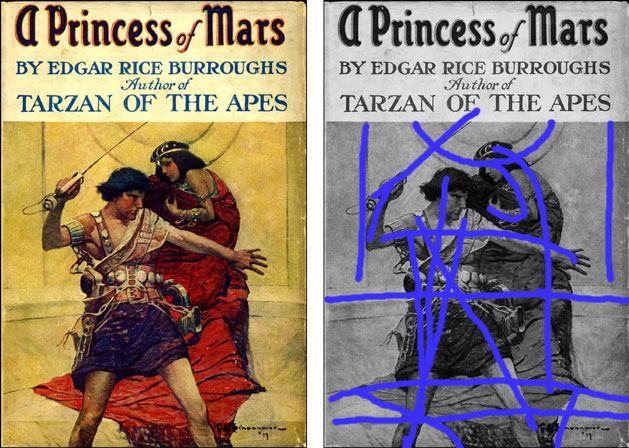 (Frank Schoonover) I sketched the above vector maps quickly, so they aren't 100% accurate, but they give the gist: other artists tend to favor verticals and horizontals; Frazetta's vectors tend to sweep around. Here are some examples of this approach in Frazetta's portrayal of swords. When he needed this sword to follow a curved vector, he tilted it and curved the tip:  But in this next piece, he straightens that same sword, because he needs it to foster a vector that points toward the woman:  Notice that her out-swept hair helps complete the vector. And, at the far right, see how the Martian's sword-tip is dimmed way down, to prevent it from interrupting a different vector loop created by the curved edge of his cape. To quote the man himself: "The overall design and composition is what I'm after. Then I fit the drawing into those shapes, unlike some artists who may sit there and just draw the figure, then try to build around the figure. I design the overall background, foreground shapes, interesting shapes, patterns, and I do it very quickly. And when I like the shapes, I just squeeze the character in. Because if you don't do it that way, you may end up with some very nice drawing, but it's static and dull and there's nothing going on. ... "I want it to move around in a certain way. Sort of like music, you know? ... I know what a certain shape does, how it lends itself to the design and composition. ... let's say the character has to be carrying a certain kind of armament, and if I know that it's a distraction, I will somehow force that shape away from your eyes so it doesn't distract, even if it means throwing a shadow over it. I will force the thing to work somehow. ~from The Comics Journal's Frazetta interview  "...I will somehow force that shape away from your eyes so it doesn't distract, even if it means throwing a shadow over it." 5.) Hierarchy of Contrast This, to me, is the most striking difference between Frazetta's work and that of other artists. Line up any handful of paintings, including a good Frazetta, and place them upside-down and at a distance, and the Frazetta will leap out at you, because of the way he manipulated contrast. Frazetta would place the starkest light-against-dark contrast at the painting's intended focal point (or, he'd closely surround that point with a handful of such contrasts). Then he'd lessen the contrast gradually throughout the rest of the painting, right out to the edges, where there was almost none at all. For balance and variety, he'd place a few spots of secondary contrast here and there, in orbit around the high-contrast focal point. And generally, he seemed to rely on a principle referred to by painter Greg Albert as "mostly, some, and a bit" -- which is to say that the painting is made up of "mostly" one value (dark, medium, or light), "some" of a second value, and then a tiny "bit" of the third value, for maximum variety. The effect of this approach, when used successfully, is to usher your attention forcefully to the picture's focal point, without creating an artificial "spotlight" effect at that point, and without implying that nothing else in the picture is worth looking at. Most painters attempt something like this, but it's an incredibly difficult balancing act, and aside from Rembrandt, Frazetta was better at it than any artist I know of. Take another look at the "vector" pictures, above. In Frazetta's "Conan the Destroyer," the hierarchy of contrast ramrods your attention into Conan's chest and face, without encouraging you to ignore the rest of the image. In the other images, the contrast is strong, but since it's spread out over broad areas, such as an entire shirt or figure, it can't compete with the potency of Frazetta's more precise handling. 6.) Hierarchy of Precision Similar to the contrast hierarchy, Frazetta would create a hierarchy of precision, beginning with vaguest suggestions of detail at the edges of a picture, and progressing gradually to the most precise rendering at the picture's focal point. In his best work, this progression is smooth enough to go unnoticed, but it still funnels our attention to the focal point, letting the rest of the image bolster that point rather than distract us from it. He was perhaps the greatest practitioner of what I call the "subordinate & celebrate" approach: subordinate (downplay) the majority of the details, and celebrate (paint the daylights out of) the most important bits. (In their attempts to create believable worlds, most other fantasy artists lavish precise rendering on everything in sight, causing every object in the picture to compete with every other object for our attention.) 7.) Kinesthetic Approach to Posing Though Frazetta portrayed people doing many unusual things, their poses usually look natural: they look like they're doing what someone would actually do in a similar situation. Other artists often invent a pose solely to fit the composition, or rely strictly on poses provided by models, even when such poses don't quite match the portrayed circumstance. But Frazetta apparently posed his figures according to how he imagined himself behaving in each scenario (i.e, the kinesthetic approach), and the result is a more credible naturalism. This kinesthetic approach, coupled with his reliance on memory, is also probably why so many of Frazetta's figures are off-balance. When in motion, we're constantly shifting our weight from one point of contact with the ground to another; we're in a near-constant state of imbalance. Most artists ignore this, posing even their moving characters in balanced stances -- often because their models have to balance themselves for the photo-shoot. But Frazetta's moving characters lean wildly: if they were suddenly hit with a freeze-ray, they would fall over. In other words, they move like us. Compare this painting, by Margaret Brundage, with Frazetta's painting of a similar struggle. Brundage's version doesn't make much kinesthetic sense: her Conan is gripping the snake at an awkward angle, and instead of recoiling in fear, her female figure appears to be doing pilates. Both characters are balanced and stable, as though modeling for the picture: 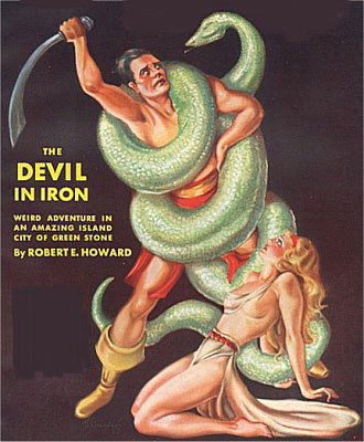 Frazetta's figure, however, is dynamically unbalanced and tipping forward in his frenzy. Unlike the man pictured above, this guy is gripping the creature in the likeliest way imaginable -- not that it will do him much good!  And that's seven. Rest in peace, Frank! **From last year: my obit for Frazetta's wife, Ellie, with a sample of her art.** **More on Frazetta.** | |
posted by LUXXXCORP @ 1:45 PM
![]()
0 Comments:
Post a Comment
<< Home